
A font was created that refers to the Stoewer family

Stoewer Überschrift is a font inspired by the Stoewer family – famous Szczecin entrepreneurs. Its creator is Jagoda Trębacz, a graduate of the Szczecin Academy of Art, but the idea for a font inspired by the lettering of machines manufactured by the Stoewers was the work of Sabina Wacławczyk from the Museum of Technology and Communication in Szczecin.
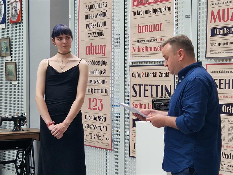
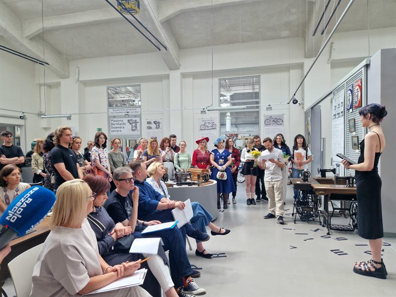
The font was officially unveiled on Monday (July 7) during Jagoda Trębacz's thesis defense at the Museum of Technology and Communication. The artist's design is intended to serve the museum, which needed a font reminiscent of the industrial aesthetics of the 19th and 20th centuries. The font will also be available freely to anyone interested.
"The originator of the idea is Sabina Wacławczyk. She was the first to come up with the idea of creating this typeface for the museum, which could be used in materials related to the Stoewer factories," explains the font's creator.
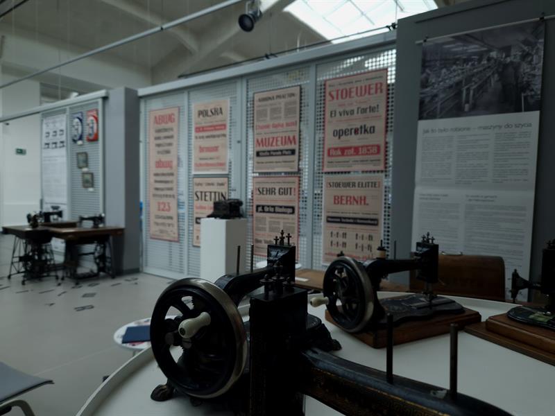
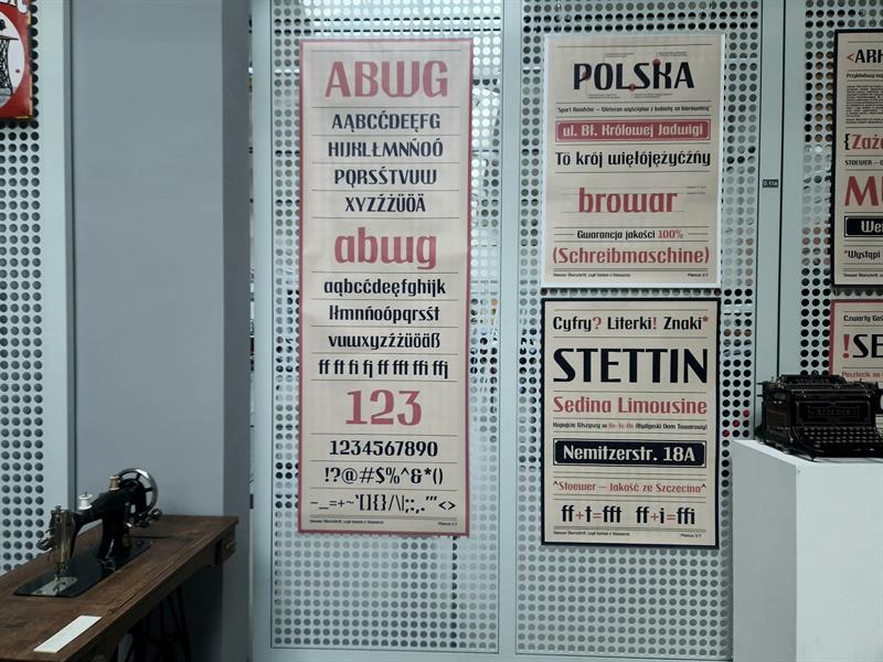
The inspiration for creating the Stoewer Überschrift came from the lettering used on typewriters and cars manufactured by Stoewer.
"For a time, the Stoewer brothers simply had the Stoewer inscription as their logo, but they didn't have any developed lettering. It wasn't yet the time when this was a given for factories. Development and marketing weren't quite there yet," explains Sabina Wacławczyk.
The font was commissioned by the Museum of Technology and Communication at the Academy of Art in Szczecin. It was there that the designer, Jagoda Trębacz, was selected, and made it her diploma thesis. The thesis supervisor is Dr. Ireneusz Kuriata, professor of AS from the Studio of Sign and Identification Design at the Faculty of Graphic Arts, Academy of Art in Szczecin.
The Stoewer Überschrift consists of basic characters: uppercase and lowercase letters, i.e., uppercase and lowercase letters, as well as diacritical marks, i.e., those characteristic of Polish and German. Jagoda Trębacz also designed the numerals, mathematical symbols, plus signs, punctuation marks, and ligatures. In total, the font consists of 133 characters.
The idea was met with great interest and appreciation from Szczecin residents – the defense was open to the public, and many people attended. The author defended her thesis with distinction. ©℗
Agata JANKOWSKA
More on this topic in Thursday's "Kurier Szczeciński" and eKurier of July 10, 2025.
@What a bunch of jerks,
2025-07-09 17:17:29
A lunatic is what I'd call someone who criticizes someone else's thesis simply because it's based on historical materials created in pre-war Germany. Heal yourself, man!
This is incomprehensible
2025-07-09 17:06:41
The promotion of German identity in lands that the Germans themselves describe as under temporary Polish administration. A generation of historical idiots has grown up and is doing everything they can to condemn themselves to reliving history.
What a bunch of guys,
2025-07-09 16:00:57
and without this, the owner will take back from Poland what is his and will also demand compensation because some Maniek protected it from flooding! The Germans will come to us themselves and we don't have to kick their asses!
Kurier Szczecinski


